2015-01-08 17:04:50
Inside Method’s Latest Package Design
2015-01-08 17:04:50

Method has a close working relationship with our retail partner, Target. Together we collaborated to create a unique limited edition program in both their cleaning aisle and their personal care aisle that offers exclusive collections every six months.
Looking for Lip gloss container?
The intent of the program is to bring new news to these aisles by offering relevant, on-trend limited edition collections that attract a new and incremental consumer into the store as well as to the brand. The program has proved to be highly successful and as a result has gotten consumers excited to return to the aisle to seek out the next collection. For both Target and Method, this program allows us an opportunity to capitalize on trends, be design-forward in areas of the store that don’t often see it, and for Method, stretch the aesthetic of the brand in new and fun ways.
THE INSPIRATION
For fall 2014, we were inspired by the bold patterns and signature color combinations that are unmistakably preppy. It’s a look we love because it is so effortlessly classic yet still stylish. The preppy aesthetic has some natural overlap with Method’s iconic look so it seemed like a great direction to pursue for fall. Both are about clean lines, fresh, crisp scents, high quality and embracing a bright, punchy color palette.
As I designed the collection, I took cues from geometric preppy patterns and bold, classic str
Method"s design lead, Deena Keller
ipes—but wanted to put my own twist on these elements and combine them in a fresh, new way. To pull this off successfully, I also needed to be sure to strike the right balance between celebrating the fashionable trend while ensuring that the entire collection was still on brand.
THE COLLECTION
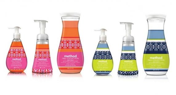
The final collection brings Method’s interpretation of preppy style to life in three different designs across hand wash, foaming hand wash and body wash. Taking signature preppy color combinations of orange + pink, kelly green + blazer blue, and navy + chartreuse, I created a collection that makes a bold statement on shelf and adds visual interest by varying the ratio of stripes to overlapping pattern for each form.
I rifted on traditional preppy patterns by overlapping two geometric patterns to make our own signature pattern that carries across the entire collection. I also played with the transparency, light and opacity of each bottle’s design to add some dimension.
For fragrance, we created clean, autumn fragrances that fit nicely with the eye-catching designs as well as with the theme: a fruity white cranberry, an herbaceous kelly moss and a rich rice milk + mallow. The result is a hand and body collection that pops on shelf and attracts the preppy and not-so-preppy alike.
THE BOTTLES + FORMULA
As with all Method products, the entire range are recyclable bottles made with 100% recycled plastic (PCR) and formulas that are non-toxic, biodegradable, free of parabens, phthalates, triclosan and EDTA and never tested on animals.
ABOUT THE AUTHOR: Deena Keller is the design lead at Method, specializing in packaging and brand design. Recently, she has been instrumental in the launch and continued success of Method’s limited edition program, leading design, strategy and execution. She is responsible for the personal care business and all of Method’s “greenskeeping” brand communication. For the past five years, Deena has worked to push the Method brand look and feel and keep it fresh and fun yet consistent across all touchpoints. She has served on the San Francisco AIGA board and her work has been recognized by IDSA, print regional annual, HOW International Design awards, AIGA (re)design awards and Color in Design awards.
- See more at: http://www.beautypackaging.com/contents/view_online-exclusives/2014-10-30/inside-methods-latest-package-design/#sthash.27hWactk.dpuf
please visit www.topbeautysh.com for more cosmetic packaging information.
LinkedIn


