2015-12-10 10:28:04
Why Pantone Chose Rose Quartz & Serenity As Its 2016 Colors of the Year
2015-12-10 10:28:04

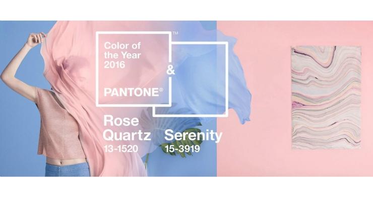
Pantone, the global authority on color and provider of professional color standards for the design industries, chooses an annual Color of the Year - and for 2016, there are two: Rose Quartz (#13-1520) and Serenity (Pantone #15-3919). The warmth of Rose Quartz represents compassion and composure, while Serenity’s blue tones reflect calmness and relaxation. Last year’s color was Marsala, and we saw marketers inspired to create all types of beauty products in the deep wine hue. We can expect the same in 2016. Why Two Colors for 2016? The upcoming year marks the first time Pantone has chosen two colors since it began announcing its Color of the Year in 2000. It’s also the first time Pantone has partnered with the photo editing app, Aviary, to create a downloadable Special Effects Pack that includes 6 filters inspired by the color duo, which will give photos a flattering “ethereal glow.” The company describes the duo as “a harmonious pairing of complementary shades,” adding that it represents “gender blur” - a trend that’s taking place in every category from fashion to fragrances. Leatrice Eiseman, executive director, Pantone Color Institute, explains, “With the whole greater than its individual parts, joined together, Serenity and Rose Quartz demonstrate an inherent balance between a warmer embracing rose tone and the cooler tranquil blue, reflecting connection and wellness as well as a soothing sense of order and peace.” Eiseman continues, “In many parts of the world we are experiencing a gender blur as it relates to fashion, which has in turn impacted color trends throughout all other areas of design. This more unilateral approach to color is coinciding with societal movements toward gender equality and fluidity, the consumers’ increased comfort with using color as a form of expression which includes a generation that has less concern about being typecast or judged, and an open exchange of digital information that has opened our eyes to different approaches to color usage.” More About the Mood Each Color Represents Consumers are seeking mindfulness and well-being as an antidote to modern day stresses, according to Eiseman. Serenity and Rose Quartz will feel like welcoming colors that will “psychologically fulfill our yearning for reassurance and security.” Rose Quartz will remind consumers to reflect on their surroundings - like looking at a “serene sunset, flushed cheek or budding flower,” according to Eiseman. Serenity is “weightless and airy, like the expanse of the blue sky above us,” Eiseman states. It is a comforting color with a calming effect, promoting a “naturally connected sense of space.” Where We Can Expect to See Serenity & Rose Quartz Serenity and Rose Quartz will no doubt be spotted everywhere next year, especially in the beauty and fashion industries. We can also expect to see the color combination used for home furnishings, electronic products, art, jewelery and accessories such as handbags, hats and footwear. Sephora has already revealed its annual Sephora + Pantone Universe beauty collection, inspired by the new hues. Home brands such as Crate & Barrel and Kitchenaid have also partnered with Pantone to design products in these colors. See this slideshow for a glimpse of some of the upcoming products designed in the new hues for 2016, plus a look at how fashion designers have been inspired by the colors; and, a look at which colors best pair with Rose Quartz and Serenity. How is the Color of the Year Chosen? The color experts at the Pantone Color Institute say they are always on the lookout for new color influences that are happening around the world. Eiseman explains, “The colors we select to be our Pantone Color of the Year are symbolic; they are a color snapshot of what we see taking place in our culture at a particular moment in time.” So they’re not chosen “on a whim.” Color is a serious business for Pantone, and its team analyzes what’s happening in all industries, including entertainment, such as films in production; art, such as traveling art collections and new artists; plus fashion, beauty, and all areas of design. They also consider popular travel destinations, lifestyle trends, socio-economic conditions, and new technologies, as well as new materials, textures and effects. Useful Tools for Designers Pantone has a few downloads on its site, including color formulas, guides and standards. Designers can download the new color standards here. Also available for purchase are a Smart Color Swatch Card for Fashion & Home; Chip replacement pages; and standard plastic chips.
Looking for compact container?
please visit www.topbeautysh.com for more cosmetic packaging information.
LinkedIn


